pethsapp
My Role
Lead Product/UX Designer.
Team
3 Developers, 1 Designer
Project
Pierre Elliott Trudeau High School
Tools
Figma, Illustrator, After Effects
Overview
Background
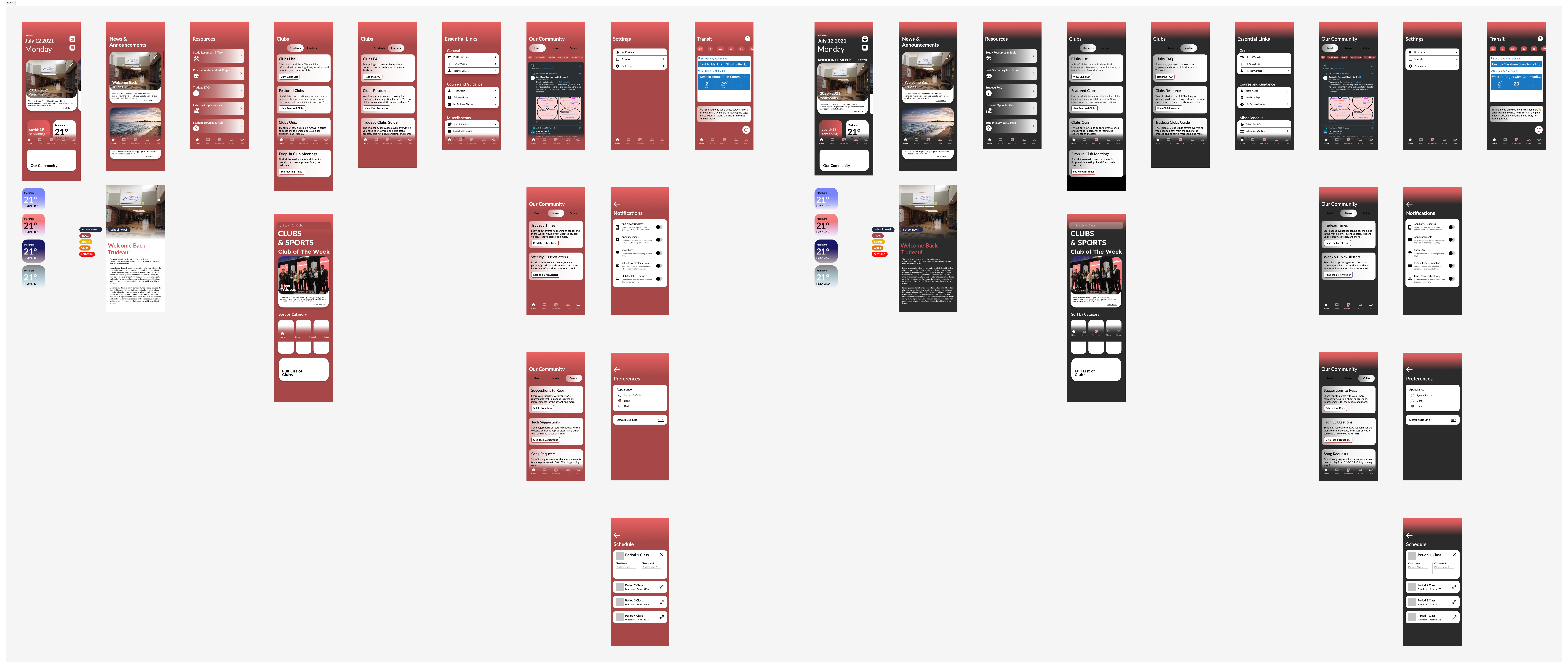
During the peak of the COVID-19 pandemic, I recognized a growing disconnect amongst students as traditional schooling was replaced by remote learning. Because of the sudden change in environment, I found that a lot of students struggle to keep up with changing guidelines and staying up to date on school wide initiatives. Throughout the development, I spearheaded a team of designers and developers to revamp the user experience and interface.

Initial Thinking
Target Users
- Students at Pierre Elliott Trudeau
- Less experienced students especially coming into from COVID-19
Research Methods
- In-person Interview
- Online Survey (Google Forms)
- Online Research
- Usability Testing
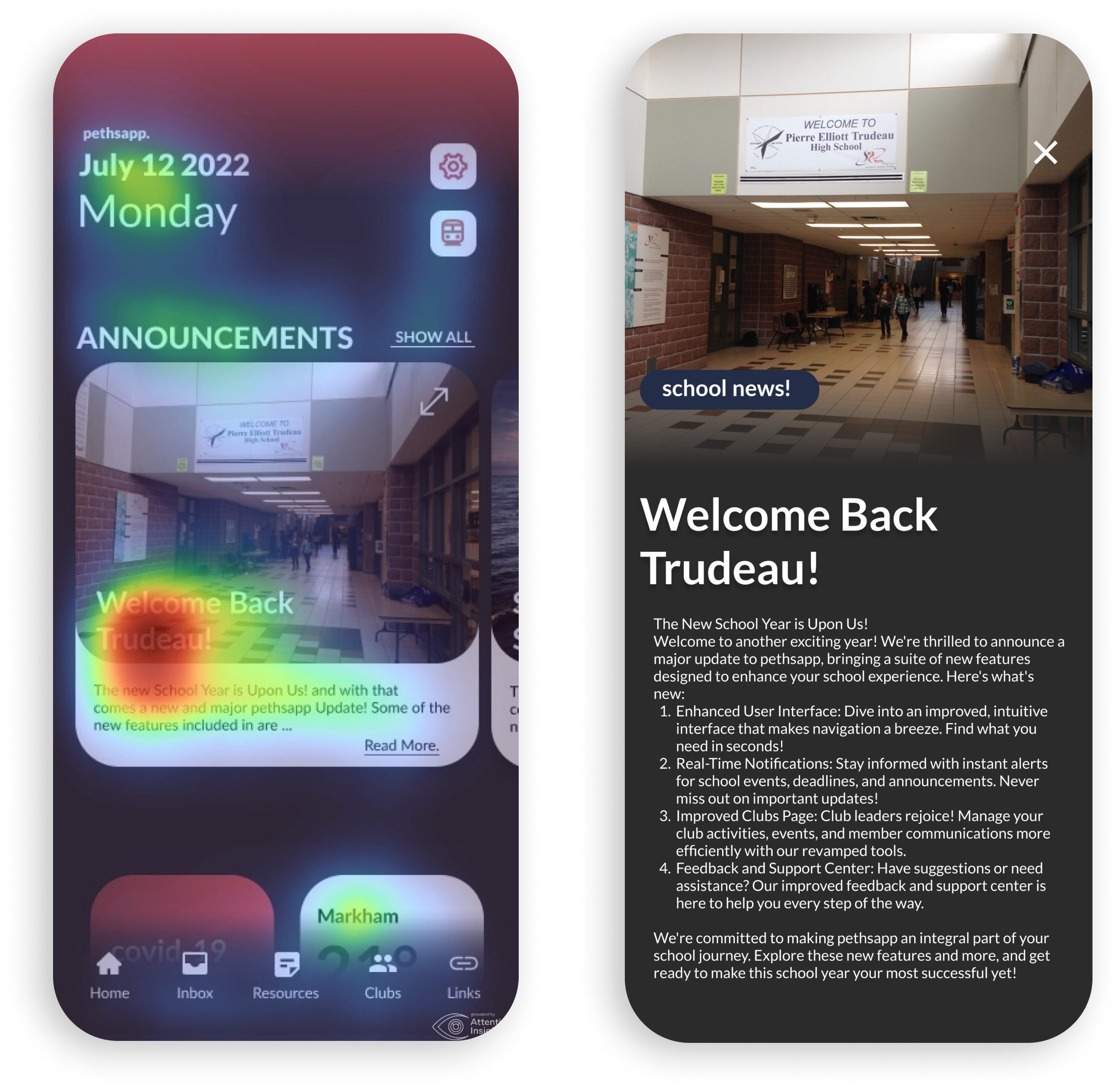
- Heatmaps and Click Tracking
User Research
Student Surverys
Where Do you usually get your information regarding events from?
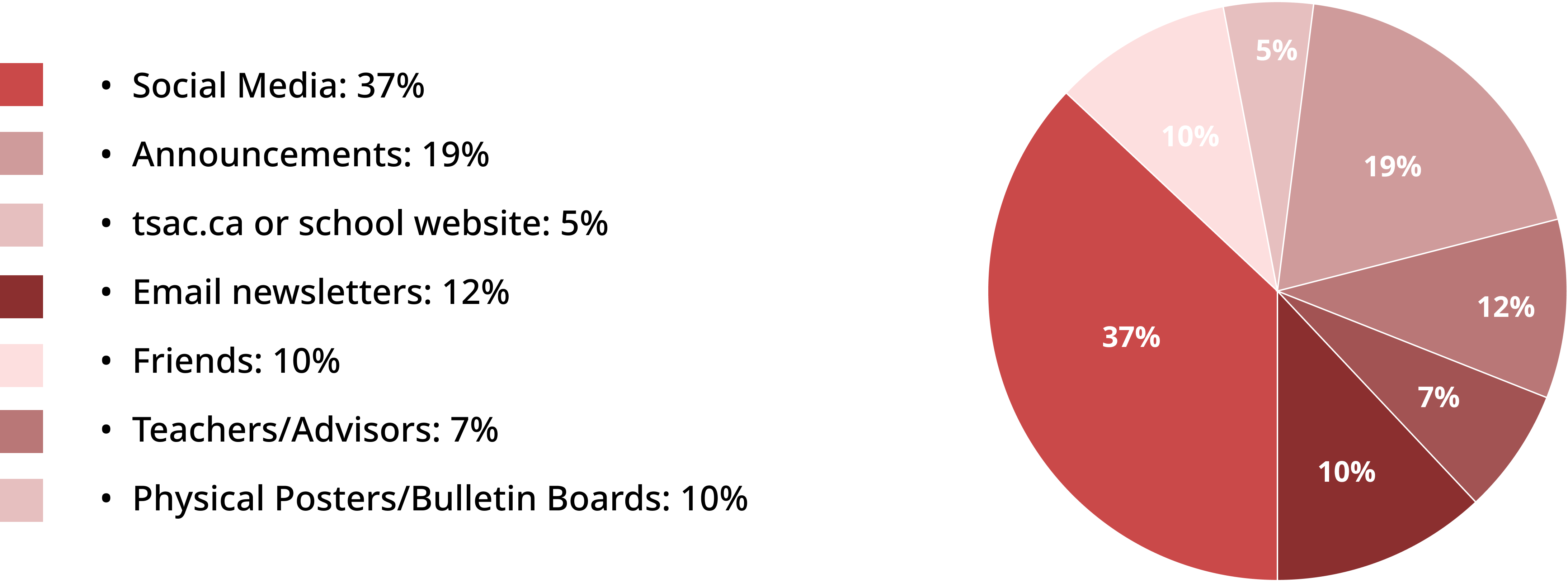
Student Survey - Clubs
User Insight
Pain Points - Students
I find school overwhelming with too many updates and changes, making it hard to stay connected within the school."
"The app's interface isn't user-friendly, and I struggle to navigate through different sections to find what I'm looking for."
"I want to receive updates only on specific types of events but there's no way to customize my preferences."
Challenge
Problem Statment
How might we develop a school app that effectively communicates event updates and COVID-19 status while ensuring user-friendliness, accurate information, and privacy, tailored to the diverse needs of the student body?
Design Solution
01
All in Platform
Optimized initial screen for users to better navigate and find up to date events and announcements
02
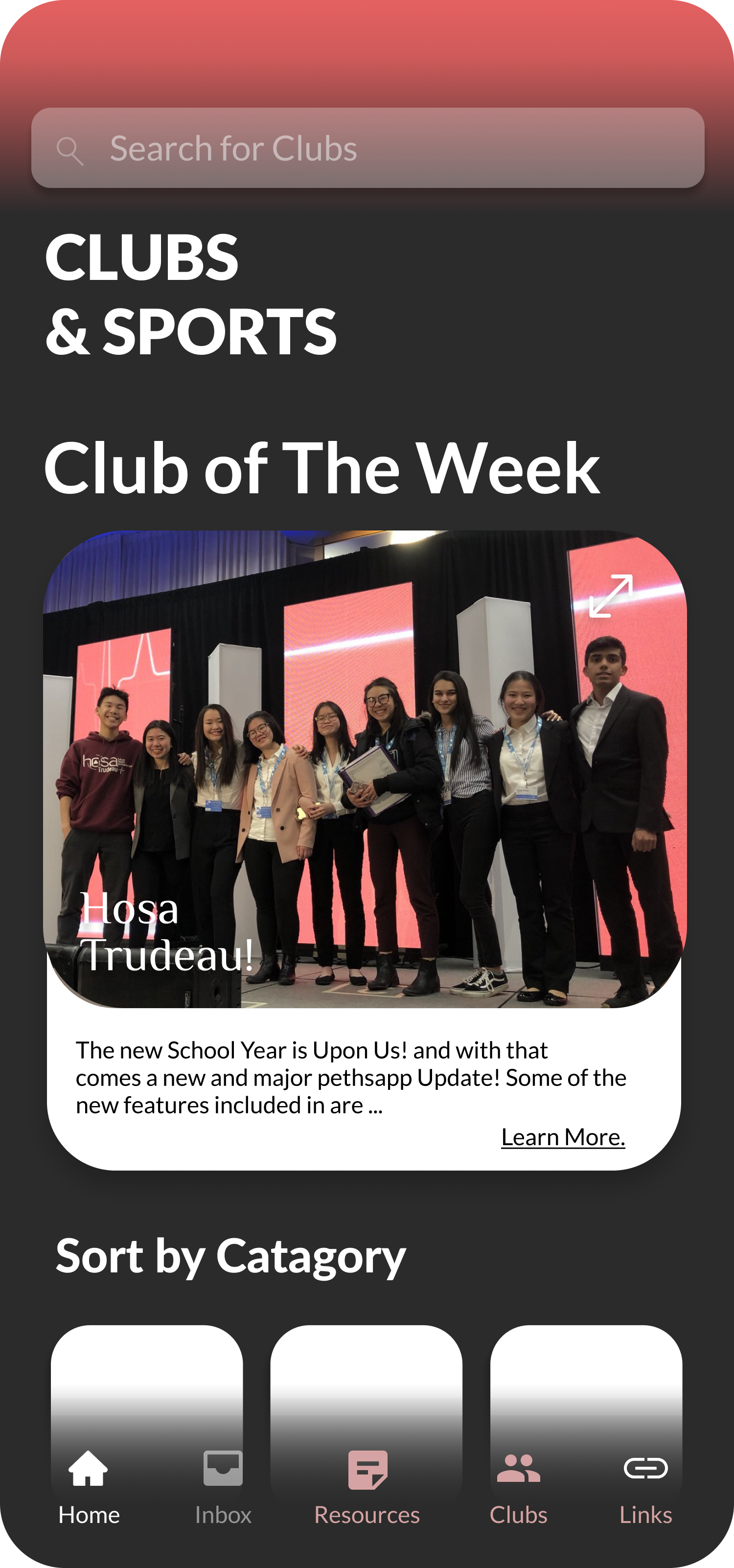
Clubs Page
Introduction of Clubs Page and Club highlights allowing users easier discovery of over 70+ Clubs and over 40% Increase of Club discovery.
03
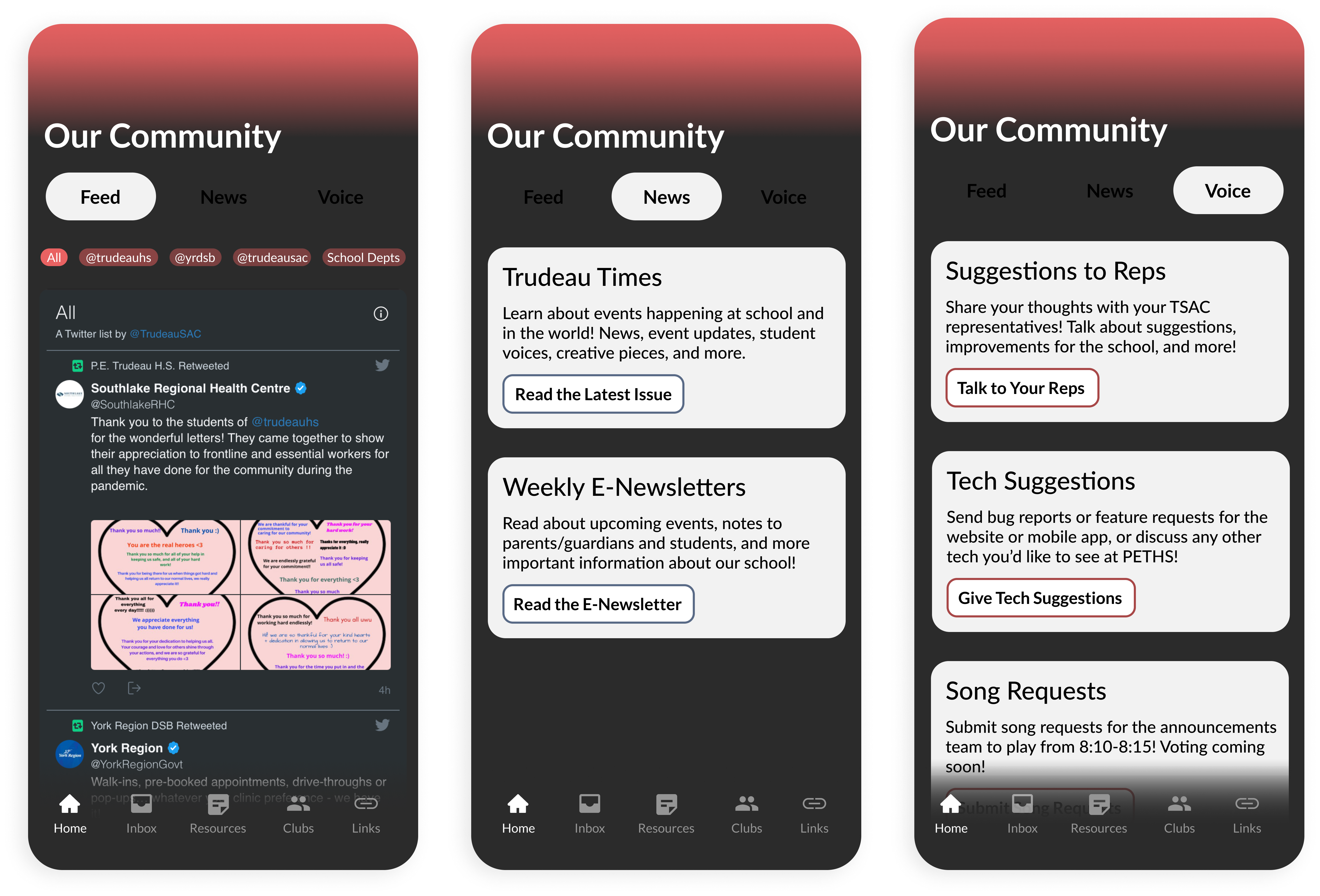
Staying Connected outside of the App
Optimized Community Page for Students to follow on Teacher/School accounts on social media and also allowing a space to give feedback to the school and Student Council.
Final Design and Reflection
Takeaway
This project taught me a lot on qualitative research methods and solid design principles thats focused on the end user. I encountered numerous challenges in devising a design that struck the perfect balance between technical feasibility, user-friendliness, and visual appeal. I believe we achieved our goal of connecting students and making events and opportunities more salient towards students. This experience has significantly sharpened my skills and deepened my understanding of creating designs that resonate with users while aligning with development constraints.
Short Video I made as part of promotion for the new school year and app!
